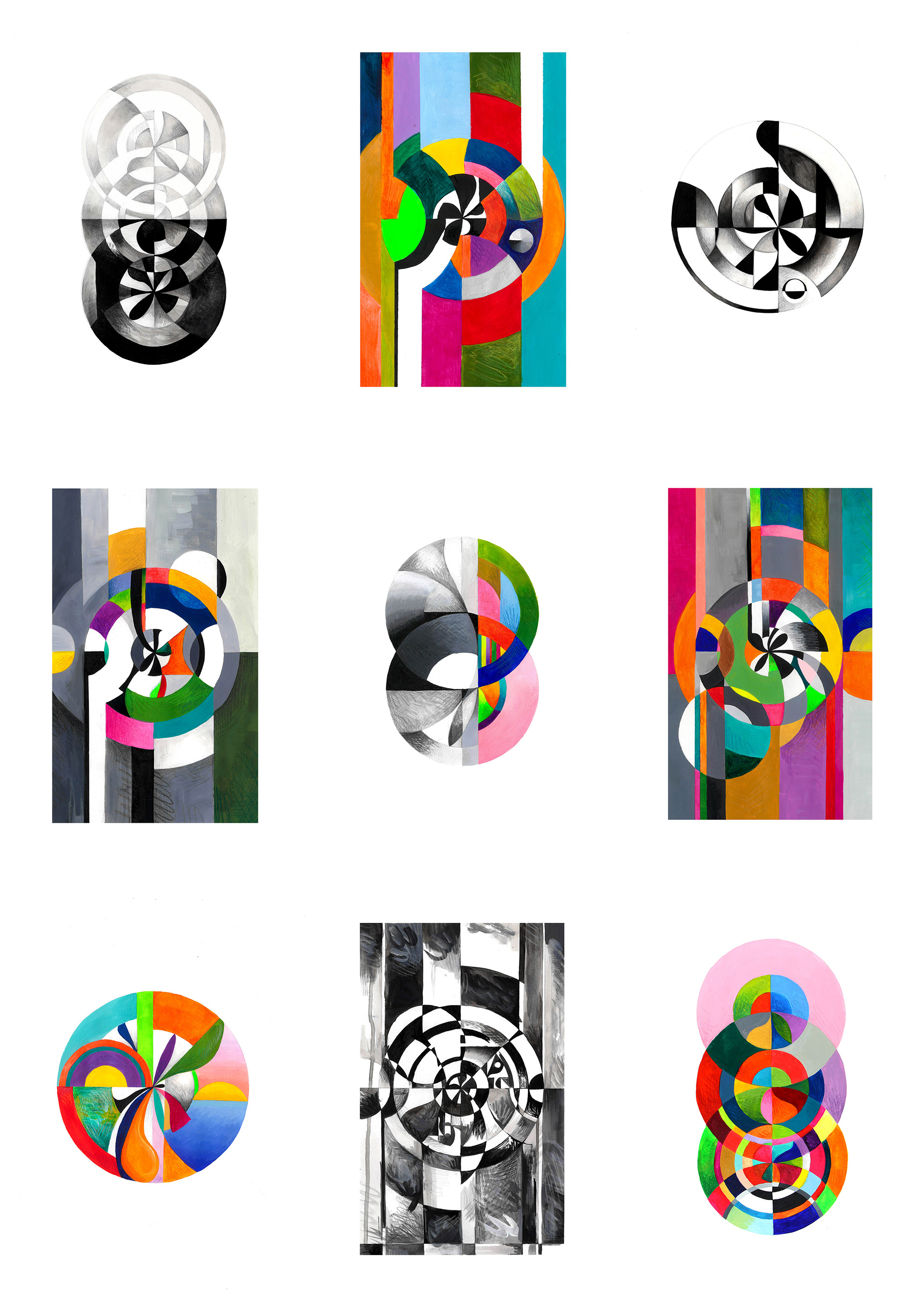
'Seeing in Colour' addresses the process of trying to tackle mental illness, specifically visualising and illustrating terms that are brought up during cognitive behavioural therapy to help people understand their negative thought processes.
For a long time I struggled to use my artwork to communicate anything meaningful to me, and avoided doing this by focusing purely on aesthetics. However I feel strongly that art is a vital reflection on societal issues and therefore pushed myself to create a project about something important and personal to me, which is mental health.
Having received cognitive behavioural therapy myself and knowing many others that had, I felt inspired to look back at it for inspiration. Often being the first step for people accessing mental health support, I thought CBT would be a topic that many would relate to, and creating work around it would help to bring it to the attention of people who are considering accessing support for their own mental health.
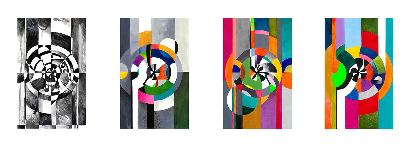
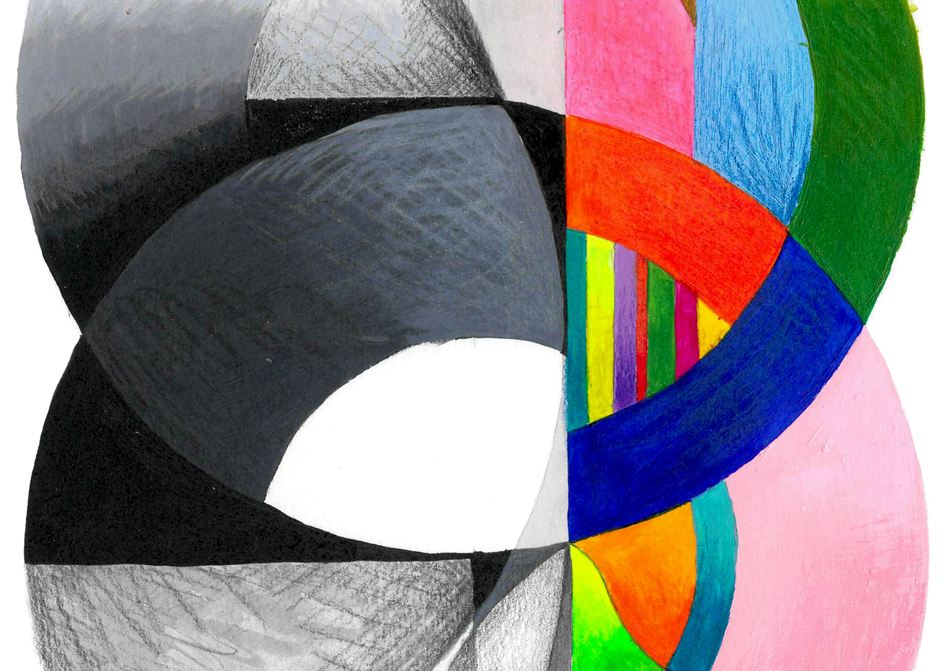
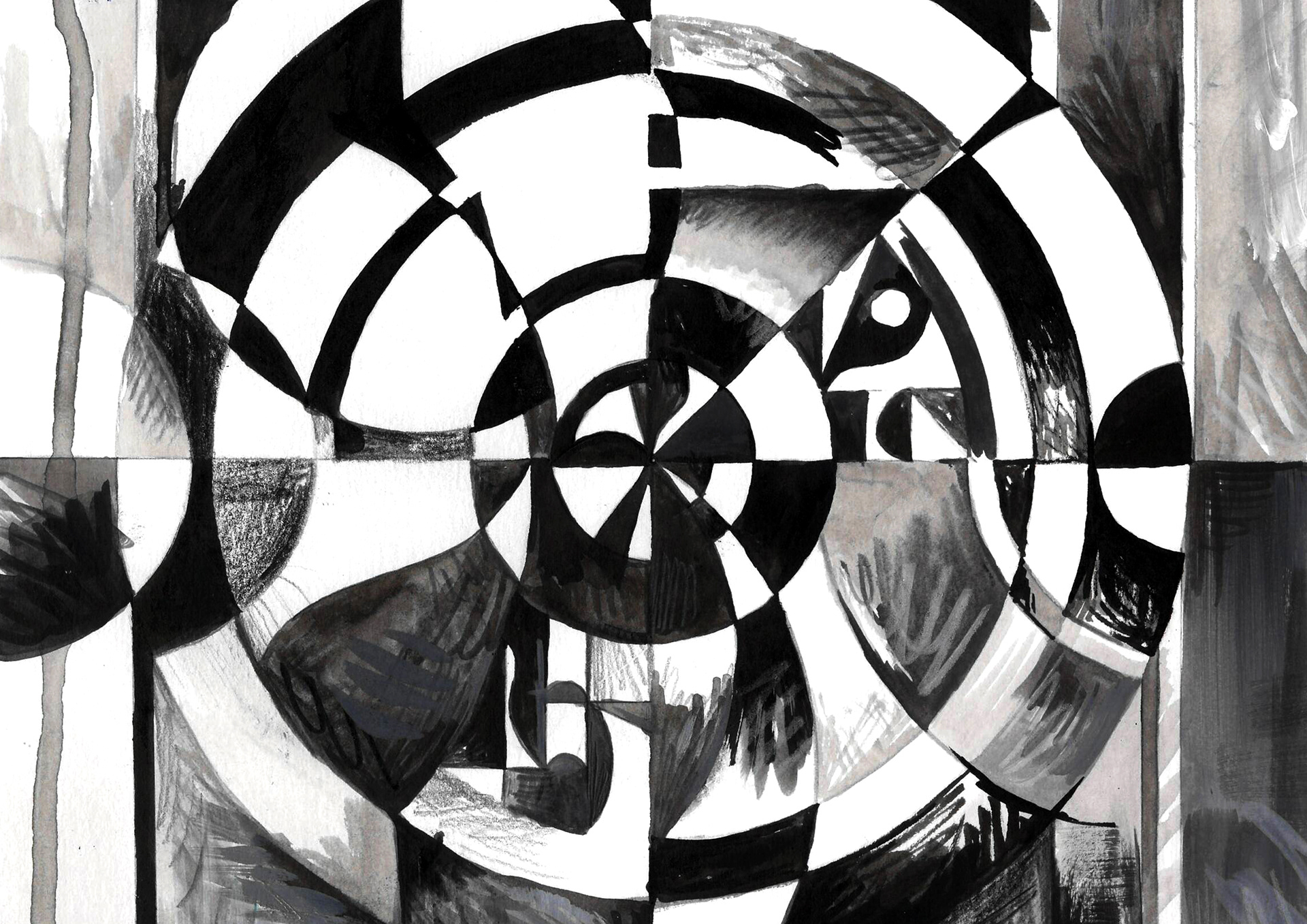
I found the language used in CBT to be heavily visual at times. This brought to my attention the importance of visualising feelings in order to better understand them, and inspired me to create illustrations based off some of the twisted thinking styles identified in the course.
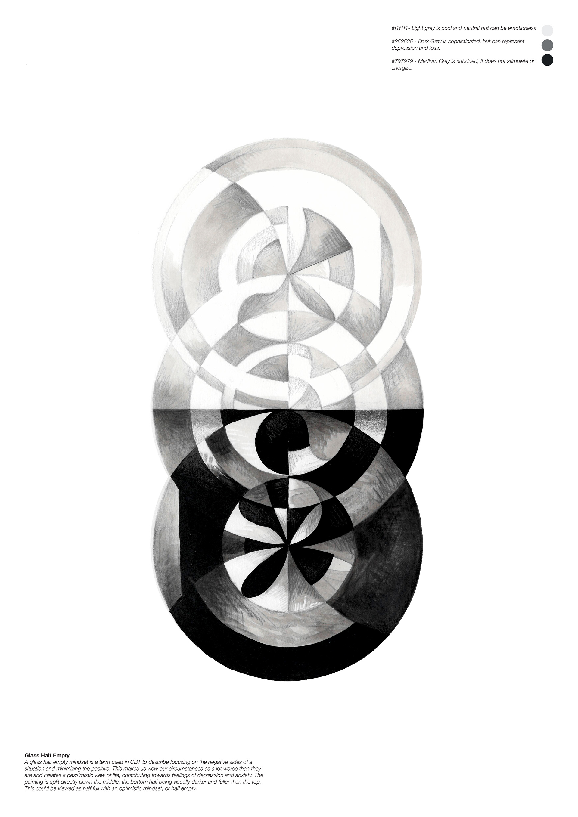
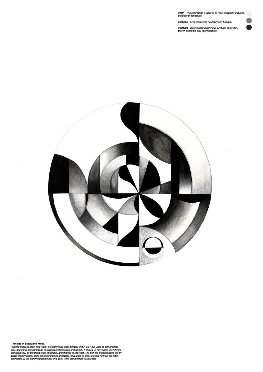
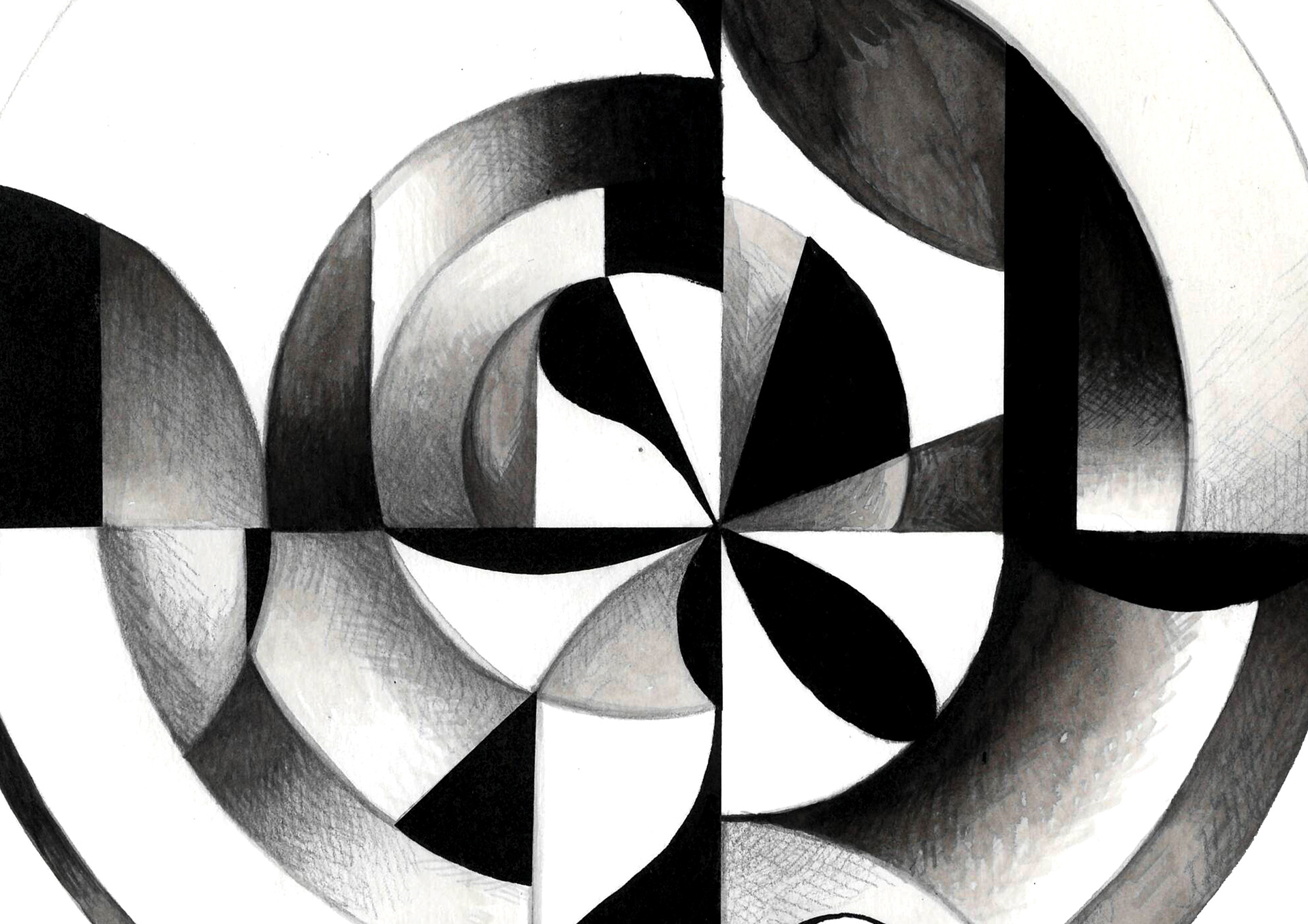
These included 'Glass Half Empty' and 'Seeing in Black and White', which I initially felt to be quite generic sayings, but I found to be very helpful in identifying and undoing my own negative thought patterns.
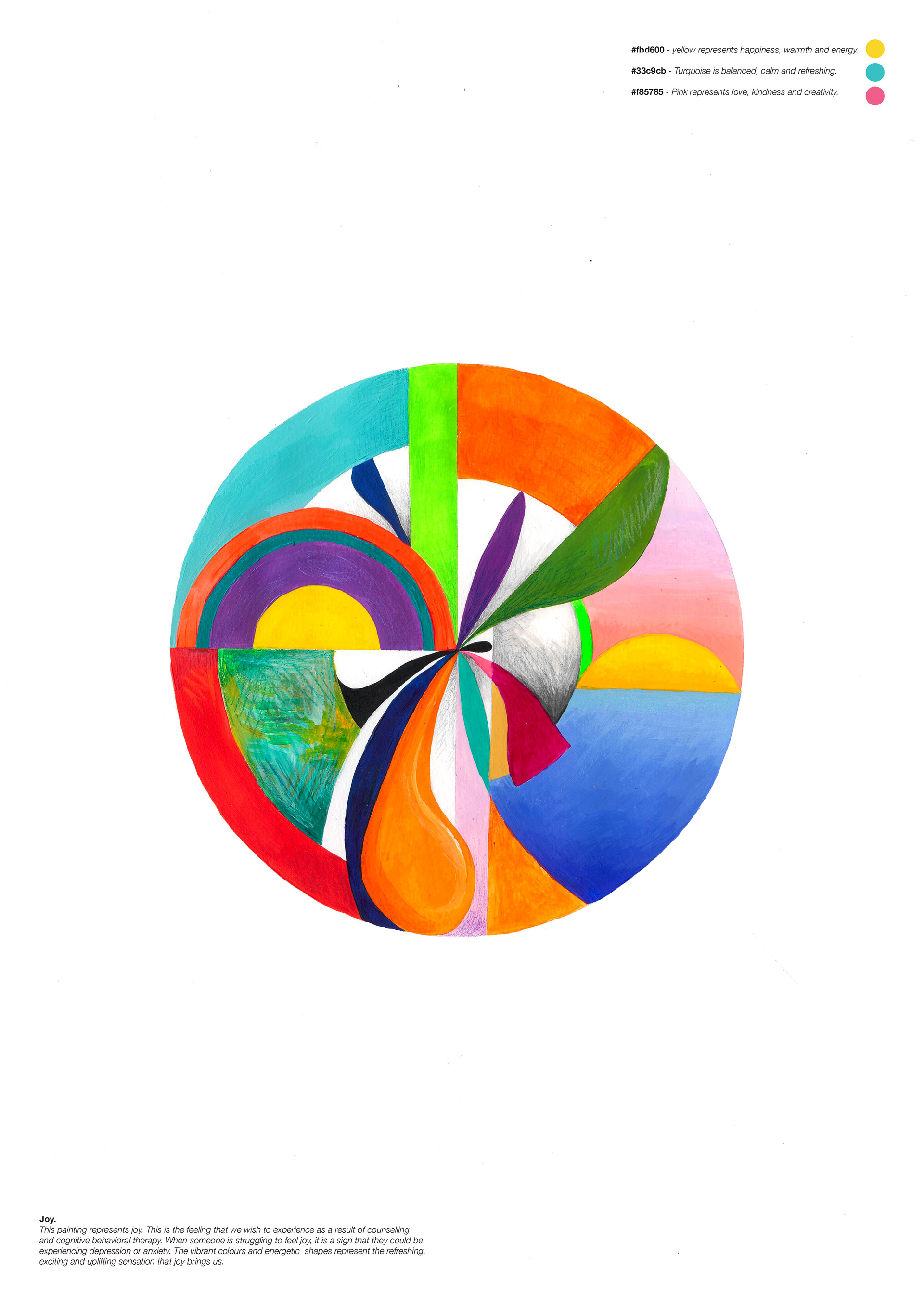
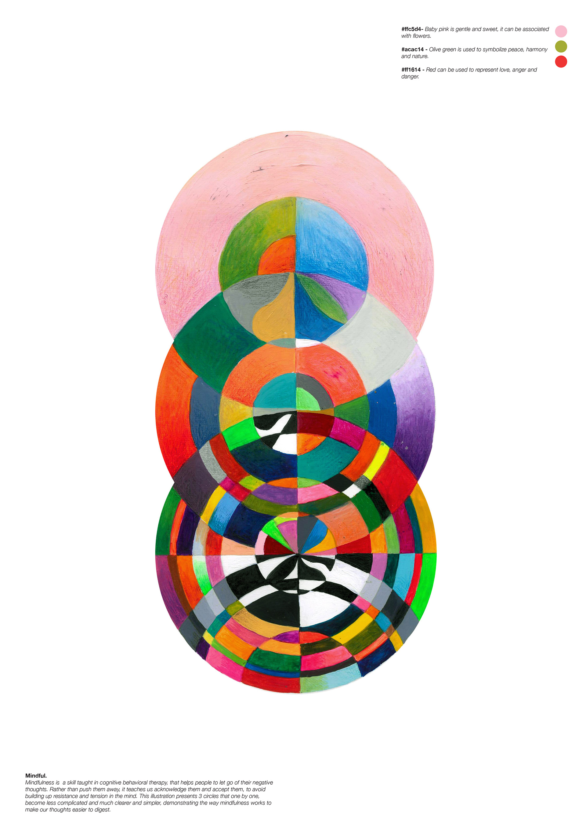
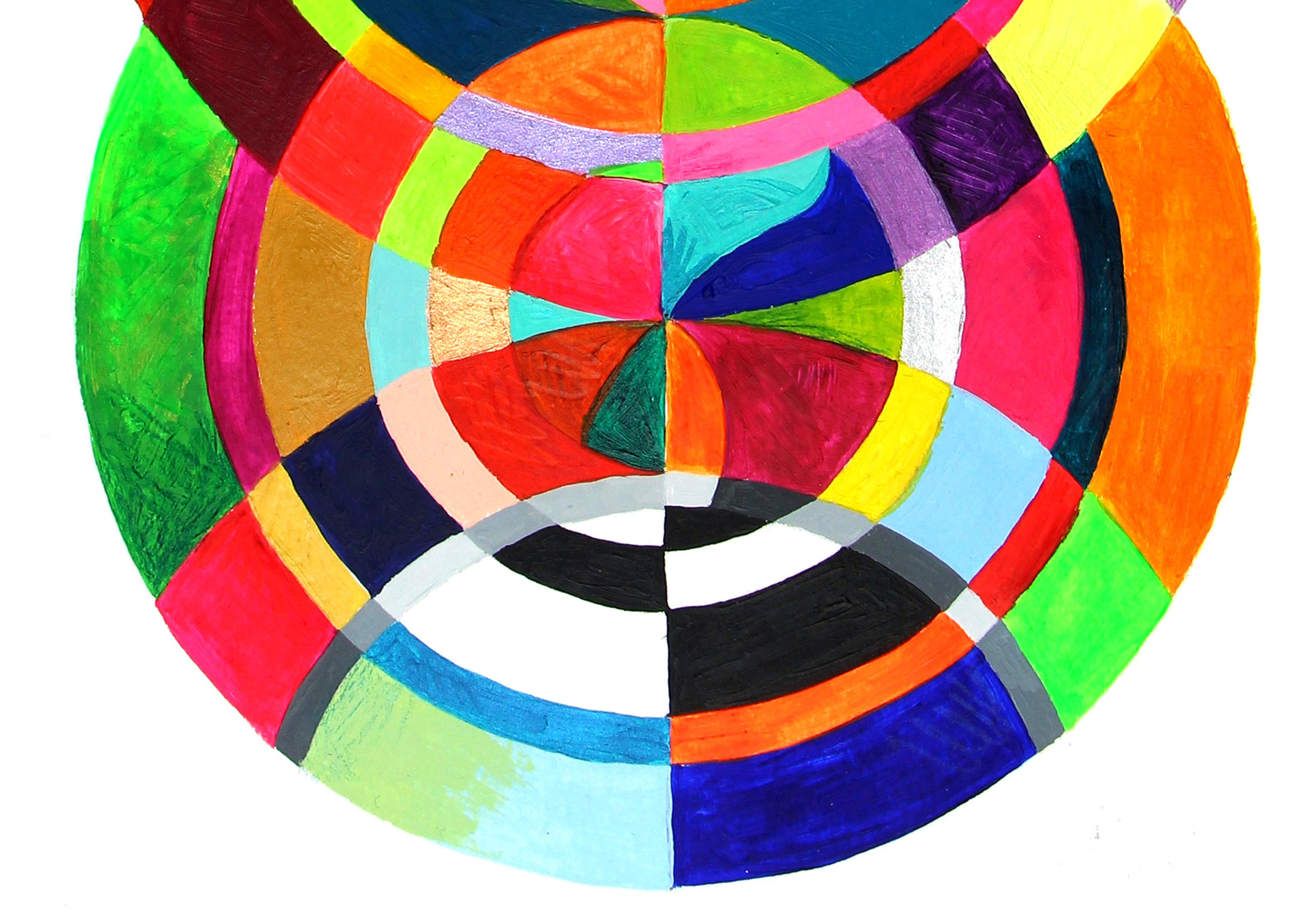
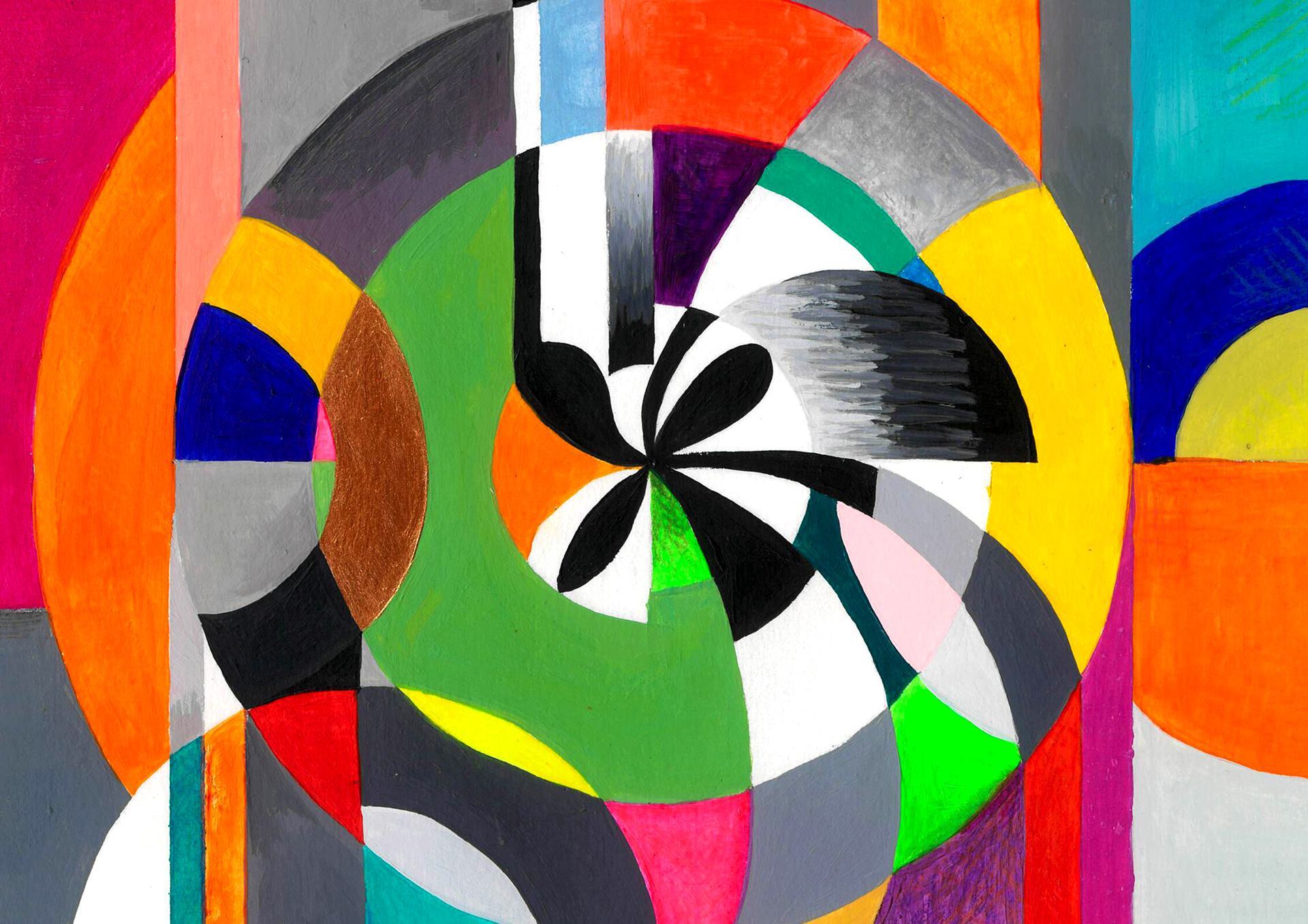
I worked towards creating aesthetics that communicated different feelings in order to build illustrations that communicated happy, sad, calm and distressed feelings, having conversations with peers about what depression felt like to them. I used the style I developed to create pieces that illustrated either twisted thinking or other words associated with mental illness and getting better, such as 'Joy', 'Optimism' and 'Mindfulness'.
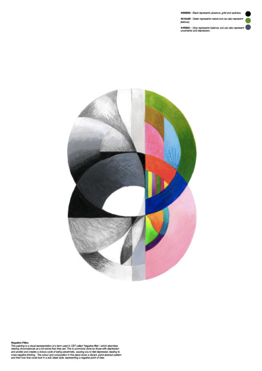
I used messy, scribbly textures in black and white to communicate sadness and distress and vibrant and pastel colours in bold shapes with smooth textures to communicate happiness and calm.
I found through conversations with different people and focus groups I held during the research process of this project, that everyone describes emotions in different ways, and that my definition and visualisation of a feeling may differ drastically from the next persons.
Therefore, 'Seeing in Colour' is my own visual definition of happiness, sadness and everything in between.